Assessors

Note to Assessors:

Welcome to my blog for Level 1 Context & Narrative . I have included a navigation page within my printed documents , in brief, it is as follows:
There are three main menus above; Assignments,  Coursework , Research & reflection
Under these menus there are further sub menus which will lead you to exercises, assignments (Planning, submissions, tutor reports and re-works), Exhibitions and books.

Self Evaluation:

I have chosen to submit all of my assignments for Context and Narrative in hard copy including prints, a contents list is included with my submission.

I was slightly daunted at the start of context and narrative but I have found it has helped me to grow immensely. I have enjoyed researching more about my ideas and feeling more confident in my selections, I feel that I am starting to understand what I enjoy.

This module focused more on understanding, research and writing so I did not really see any growth technically, hopefully I will continue to improve on this in future modules. My camera has been a little more idle than usual but I can honestly say that context & narrative has really altered my approach to my way of working and opened my eyes to a deeper level of understanding.

My tutor was extremely encouraging and really helped me to be more confident with my ideas.

Technically I have not grown as much as I would have liked but the difference between EYV and C&N in my level of understanding and commitment is vast. My observation and composition have worked well in all of my assignments and I have known when to change path. I think my ideas are communicated effectively and leave a question mark so that the viewer may want to discover more.

I think I have been creative with my ideas and also with my experiments surrounding presentation.

I look forward to continued growth in my next module.

Project 2 The archive

Exercise – Question for Seller

I have been fascinated with old photographs for a long time and I often look on eBay, I have even purchased the odd set. I also still have a bag full of old negatives from my own family which I keep meaning to scan. I am intrigued as to why some sets of images in eBay command such a high price when others seem to sell for very little? The Question for Seller work has opened my mind to the option to ask the seller more about the images something i never considered to do before.

Does their presence on a gallery wall give these images an elevated status?

I think they change the meaning of the image. Initially they would have been taken to capture a moment or store a memory for the families use. Now they are show away from their album of associated images so the narrative is changed. the audience no longer sees the images before after, they have no personal connection to the person so they can create a new ‘story’. The image is more regarded and considered, more is read into its composition, so yes the images status is changed and regarded in a more elevated status.

Where does their meaning derive from?

I think the meaning of these images derives more from the answer to the question posed to the seller, It starts or creates the narrative that we should attribute to the image. Were they found? Where they abandoned? Unwanted? or loved?

When they are sold (Again on eBay, via auction direct from the gallery) is their value increased by the fact they are now ‘art’? 

The rise in value could be attributed to them now being considered ‘art’ but I also think there are other factors which can lead to this.

The fact that it included audience participation puts people in a position of wanting to be part of something, in a similar way to charity auctions where people don’t necessarily bid because they want something but rather for the ’cause’, it allows them in to a select group of winning bidders that get a congratulatory pat on the back.

It also is because of the newly added provenance, there is now another history / story which can be added to these images which can be proven.

I think these factors are more relevant that it just being because of ‘art’

Research Point – Gregory Crewdson

Unfortunately the YouTube link provided did not work however I was fortunate enough to visit ‘Cathedral of the Pines’ at The Photographers Gallery so that has provided some insight into his work.

Do you think there is more to this work than aesthetic beauty?

Crewdson’s images are definitely more than just aesthetic beauty, they are meticulously orchestrated and every leading line, frame within a frame, prop and colours carefully considered. I do however feel that Crewdson is more of a producer, but a producer with a vision.

Do you think Crewdson succeeds in making his work ‘psychological’? What does this mean?

His images certainly evoke a feeling or an awareness of events which I think draws your mind into the image. When I saw his work I felt that I was drawn into finding the story in the image.

What is your main goal when making pictures? Do you think there’s anything wrong with making beauty your main goal? Why or why not?

Currently my main goal is to meet the brief for an assignment, previously (Before this course) It was what was considered a good / nice picture. Beauty is fleeting, I have learnt that a beautiful scene does not allow me to linger for long. I might wish to visit a place after seeing the beauty of it but I do not try to read much more, I think my new goal is to consider my message more, if it is to share the beauty of something then that is acceptable but if I have a deeper message then i might need to look beyond this.

Project 1 Setting the scene

Exercise – Goodfella’s

I don’t recall ever having watched the film Goodfellas so this clip was new to me, I am quite interested to see if my initial opinions change if I watch the entire movie.

What does the scene tell me about the main character?

He is well know and I get the sense that he is important. the car and his flippant approach to it sends a signal of money, but i get the feeling it is ‘new’ money not ‘old’. The secret entrance alludes to him being ‘in the know’ and of a select special group. He tips everyone generously and appears to not only know the route into the club well but even the catering staff are not surprised to see him… he is a regular. He enters the club and immediately a table is ushered, again he tips but this time more discreetly. The lighting and colours all make the scene feel both lavish and dangerous.

But…

I cant help but feel that this is a ‘set up’, the staff seem to know him too well? Could he really work there and this is some elaborate rouse? Is it the lady that has the wealth and he is building up to a con?

I now need to watch the movie to find out.


Reading Pictures – Research – Singular Images: Essays on Remarkable Photographs by Sophie Howarth

2018-02-17 12.01.47

I am lucky enough to have a copy of this book, reading through the essay I find it focuses on pity for the family in the image. This is repeated a number of times throughout the essay. This is an easy assumption given that Arbus was know for photographing the margins and freaks of society.

I was a simple essay to read which is why I purchased this book in the first place but what I found really interesting was the story behind the image and looking at the smaller signs which is what leads us to pity the family. I feel affronted for them, poor Richard and Marylin Dauria forever immortalised and most likely chosen because they had a disabled child. The child most likely fitting into Arbus’ marginal society category.  We are left to pity rather than celebrate this young family. Maybe Marylin did dream of grander things in life but the fact that at a young age they embraced and accepted the role of raising a child who ,as we are led to believe ,is mentally retarded is an achievement in itself. They still maintain their attempt at imitating their possible role models Elizabeth Taylor and James Dean.

What i also find intriguing is where the third child is? Why are they not included in this family scene? I looked at the other image mentioned in the text that was shot in the family home, again there is no third child however this image does not illicit as much pity perhaps this is why this was not the ‘chosen’ image.

da1

Reading pictures – Research point Jeff Wall’s Insomnia


insomnia-91994
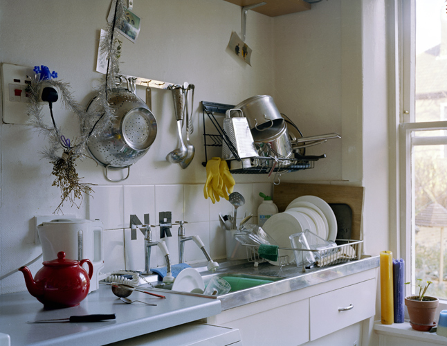
Jeff Wall’s , Insomnia (1994)

I found it useful to read Sharon’s blog on the OCA in relation to Jeff Walls Insomnia image. I would not have considered the wider context of art, literature and film , I will try to consider this when completing my assignment and look beyond the digital image to the printed image as this also provides information by the way it is presented.

He is what I understand / see so far:

Denotation – What we can see in the image.

I see a kitchen (Deduced by the cooker, sink, fridge, table and units. I see a man laying on the floor under the table. A window with a reflected light.

Connotation – What we interpret about the image, what might it mean.

I see a cold kitchen, there are no signs of warmth or family. The lighting is harsh, the reflection in the windows suggests it is night-time and there is no view. The image feels sinister and ‘dark’. It is unsettling.

Studium – Cultural, political or social meaning.

Here is where I struggle a little  but the title explains that the image relates to insomnia, the kitchen looks sparse, perhaps the insomnia has affected his social standing in life. Considering the image is dated 1994 the kitchen looks dated  therefore I place the man in the stereotype of lower / working class.

Punctum – Disruptive element to the image which can change the interpretation of the image. Here is where I get a little lost? I am presuming that the punctum is the man laying on the floor.

Jeff Wall’s image Insomnia draws my eyes around the image. I find i look initially to the table , then across the turquoise cabinets to the paper bag on the fridge until finally they rest on the man laying under the table. Every area of the frame is filled with visual clues and information, each time I look I see more than before. The image follows the golden ratio in compostion but is equally divided into thirds horizontally by the floor, the table and the window.

In the foreground is a table which appears to belong to a couple maybe? There are two chairs. The chairs are not matching and one is turned away from the other, could this be symbolic of the relationship? On the table there is a single salt shaker and an ashtray which appears unused. I am left to presume that it is the partner that smokes otherwise I would expect to see stubs left by the insomniac man.

Following across the image is a large old cooker with a small solitary saucepan on top, on the wall above the cooker is a circular mark / stain left by an old wall hanging. A clock I presume, another clue to direct us to his insomnia, Whenever I have been unable to sleep I constantly clock watch to see how much time has elaspsed , perhaps this is what this relates to?

In the background we see very dated turquoise kitchen units, a larder cupboard and small cupboard are left ajar. Was he looking for snacks? Making a drink? Or perhaps he was looking for medicines to help him sleep? The coffee pot on the counter below is empty, Coffee would not help him sleep! The sink appears full as does the draining board. The window above the sink shows the reflection of the stark flourescent light, You can see it is night-time, another clue, there is a fence beyond the window. The room appears walled in, trapped by the fence.. more suggestions.

Looking right there is the fridge on which the paper bag sits, did he pop out to visit a drug store to get something to help him sleep? Did he get food?

Then we look to the man on the floor, he is almost laying a fetal position, actually more of a recovery position. His eyes are open and he looks uncomfortable. His head does not appear to be touching the cushion he is holding under himself, in fact is it a cushion?

Perhaps the title has misled me along with the clues? If I could image this were a bag of frozen peas taken from the freezer held under him , the paper bag held a bottle of liquor from the store then I could image a fight, a tiff, a quarrel. The chairs facing in opposite directions, the missing coffee pot meant to sober him up. Did the partner hide in the cupboard? What could they have fought over?

Without the aid of the title I can see two different narrations to this image.

The image feels very dark and sinister, it reminds me a little of Gregory Crewdsons work in that I find myself looking around the image finding clues to help me build a story.

Project 2 – Reading Pictures

Exercise
Rip out an advertising image from a newspaper supplement and circle and write on
as many parts of the image as you can. Comment on what it is, what it says about
the product and why you think it’s there. You could use this as the basis for your
assignment if you feel it’s taking you somewhere interesting. Or you could adopt this
method for your assignment preparation.
Come back to this exercise when you’ve reached the end of Part Four and see if you
can add anything to your analysis.

For this exercise I have ripped out an Olay eyes advertisement. I am already aware of the Z pattern used in advertising and this image is a perfect demonstration of this. 

2018-02-17 11.30.30

My eyes are drawn directly to the models eyes and nose , mainly because they are prominent as well as centrally focused but also because they are the area that has been lit by a light source. This clever use of light ensures that we look are the correct spot in the image then as nature dictates we read left to right so will explore the image in a Z pattern. Therefore my eyes track across the models eyes back to the left over the nose, I then see the text which informs me what the image is about. ‘Eyes should show emotion not our age’ I now understand a little more about the image and as my eyes continue to read from left to right I see that the ‘New’ product Olay eyes can help me show my emotion and hide my age! Conveniently the models skin is flawless with no visible signs of age although to be honest she does yet seem to be of an age that would require wrinkle creams but as a consumer we are supposed to ‘buy in’ to this perception of perfection which cannot be achieved by nature alone (Or so we are lead to believe).

2018-02-17 11.31.04


Project 1 – The Language of Photography

In the course material we are asked to looking more closely at the following image and to make notes on how the subject matter is placed in the frame:

download
Elliott Erwitt, New York, 1974

I have always liked the humour in Elliott Erwitt’s images and this one is no exception.

Firstly to view this image as a flat image rather than putting myself in the picture I look to see how depth is captured, I can see this by the background and the shallow depth of field effect. I can see a structure to the right of the image, the main subjects appear to be on a path. As the title says New York I am thinking that this could be a stroll through central park (Perhaps the structure would be recognisable to locals so that the image could be placed).

The subjects are centred to the frame although the rule of thirds applies both vertically and horizontally. The main subject however is the smaller dog to the right. The horizon line is lost which strengthens the vertical lines in the image (The legs)

The image has been taken close to the ground offering us the viewpoint of the small dog, his size highlighted by the legs beside him.One first glance you might see two pairs of human legs but the humour comes when you realise the legs on the left belong to another dog. The image has been cropped / framed tightly to allow this assumption to happen. The colour of the image is balanced as the darker areas (The owners black boots) are centralised.

Your eyes are naturally drawn to the small dog as you are on his level as well as him being the only subject with eye contact. Your eyes are then drawn to the centre and left to look up and down at the legs. After seeing the humour my eyes rest back on the little dog. I feel both humour and the situation and sympathy for this little dog who is dwarfed by his companions.

A similar image by Elliott Erwitt:

2015-02-05_1028
Elliott Erwitt, New York City, 1946

In this image depth and perspective are acheived by the buildings running into the distance. This diagonal line is also what draws your eye from the dog to the feet.  Although the feet are in the fiorground it feels as though the dog is dominant in this image, this is the effect given by the doagonal lines that your eyes are drawn along. The dog has an interesting wide stance akin to a bulldog. There is a disparity between the pair , the lady is wearing sandals whilst the dog wears a thick jumper.

I can see that he is not on a lead but is obviously obedient, I can just see the tip of the owner of the shoes skirt…Is she bending over the dog giving commands?

Auto Focus

Auto Focus – The self-portrait in contemporary photography by Susan Bright.

This book is a really interesting insight into self portraiture although I was rather disappointed that absent portraiture was not really featured.

It is however interesting to see how individual each photographers approach to self portraiture is and the reasons behind the images.

There were a few images in which the photographer could not be seen such as those by Danny Treacy , Hew Locke , Julie Pochron , Nick Cave and Siya Singh but in my opinion they are not truly absent from the image.

I found the images taken by Nanna Saarhelo interesting in a fly on the wall approach. In her series ‘Sleep with me’ Saarhelo positioned a camera on a timer above her bed. As she slept in the bed with various people it took photos every 30 minutes. I find these images interesting as the dynamics of her relationship to those in her bed could be examined in the images, the closeness or distance captured whilst they slept.

I love Tatsumi Orimoto’s mother! The humour in the images and her sour deadpan face really chuckle me. The images appear so absurd but what baffles me the most is how a woman of her obvious age got herself into oil drums and giant cardboard boxes. I find myself wishing that there were before and after ‘out take’ shots as I think there might be more humour in seeing how it was done.


Project 3 Self-absented portraiture

Nigel Shafran – Washing Up

Nigel Shafans series ‘Washing Up’ is a collection of images alongside text which shows us the mundane daily chore of washing up along side a list of food and meals. I find it interesting to explore the image and attempt to decipher the time and month in which it was taken. I look for clues and I am left wondering who it was that washed up, where have they gone and what do they do?

http://nigelshafran.com/category/washing-up-2000-2000/page/2/ (Accessed 21.01.18)

001washing_up

Nigel Shafran, 4th January 2000. Three bean soup, cauliflower vegetable cheese. Morning
coffee and croissants. From the series Washing-up. 

In this image I can see the remnants of Christmas as tinsel hangs by the colander but there are new buds showing on the plant by the window which has bathed the kitchen in a fresh white light. A teapot makes me wonder if there were guests for tea? The colours and shapes in this image work well together. The bright red round teapot, the tall cylindrical yellow and purple candles, the yellow marigold gloves and the green of the washing up bowl. The colours are bright yet seem subtle in the composition due to the fresh white light but they help to make your eyes travel around the image. The caption to the image which was provided in the course material is at odds with the image? I see teapot yet it says coffee, this makes me wonder further about who came to tea?

This style of Self Portraiture appeals to me, I am already thinking / leaning in this direction.

Did it surprise you that this was taken by a man? Why?

No, it didn’t surprise me? If the expected response would be because of gender roles then this is not something that would have occurred to me. My husband is equally capable of washing up or doing the laundry as I am so I do not see why a man taking a picture of a sink should surprise me. We only allude to the fact that he is the washer-up-er, he could merely be an observer?

In your opinion does gender contribute to the creation of an image?

Not necessarily but our creation of images comes from the influences of the world around us and what we are exposed to or experience. This then could contribute to the creation of an image in terms of gender.

What does this series achieve  by not including people?

I am left to consider the scene and to draw conclusions or observations about both the photographer and his life. I am then left to think about what my own sink or meals would say about me and what this scenario is like around the world?

Do you regard them as interesting ‘ still life’ compositions?

An interesting composition is one which leaves me with questions and makes me consider things. I am drawn to these ‘still life’s’ and I find them to be an effective way to look at someone / someones life in a way in which you can draw parallels or sympathise.  The mundane exists in everyone’s lives but this ‘still life’ highlights how individual yet shared the mundane can be.