Do some research into contemporary street photography. Helen Levitt, Joel Meyerowitz, Paul Graham, Joel Sternfeld and Martin Parr are some good names to start with, but you may be able to find further examples for yourself. Make notes in your learning log.
I have previously researched Helen Levitt in EYV (https://wendyrose.blog/category/research-reflection/intro-to-he-research-assignment/)
Joel Meyerowitz:
Paul Graham:
Joel Sternfeld:
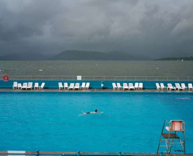
Martin Parr:
Elliott Erwitt:
• What difference does colour make to a genre that traditionally was predominantly black and white?
I have always enjoyed black and white photographs and many photos in my home of my family are in black and white. I think this is simply because I don’t want to be distracted by the colour, I want to focus on the content of the image, and according to my daughter because I always romanticise things. However when I started this course I kept to using colour and I have learned to really enjoy colour in my images now. The main difference for me is that there is an extra dimension in colour photography that adds feeling. A grey overcast image differs greatly from a bright colourful image. The images in my last assignment of EYV would not have had the same effect had I presented these images in monochrome.
On the street however colour can sometimes looks ‘ snapshot’ style whereas monochrome appears more authentic and serious. Monochrome also lends itself well to a series as the extra dimension of colour does not need to be considered. Monochrome can also feel more ‘moody’ and focuses the attention to what is in the frame without the distraction of colour. However colour is very much of our time, you can get a sense of era just from the colours used in everyday clothing and surroundings, the image becomes a document to time and place. There is more to see and more information contained in the colour image.
I think that the final choice of using colour over monochrome depends entirely on the intended message that the photographer wants the image to portray. There is a for and against for both in street photography, the question that needs to be asked on reviewing an image is ‘what’s does it add, or not add?’.
Shooting only in black and white filters the choices of subject on the street, I feel that in monochrome I gravitate to gritty images or images with interesting architecture or contrasts whereas shooting in colour I focus on what is happening in the frame and sometimes look at the colour to draw attention.
• Can you spot the shift away from the influence of surrealism (as in Cartier-Bresson’s work)?
As quoted on the Tate’s website:
http://www.tate.org.uk/art/art-terms/s/surrealism
Surrealism aimed to revolutionise human experience, rejecting a rational vision of life in favour of one that asserted the value of the unconscious and dreams. The movement’s poets and artists found magic and strange beauty in the unexpected and the uncanny, the disregarded and the unconventional.
Images from Man Ray are a prime example of surrealism in photography, images were manipulated and the art form stretched to show creativity and variety. The medium of photography was being explored and boundaries pushed, double exposure, printing, montage, solarization and distortion were used by photographers. Cartier-Bresson’s early work explored surrealism by flattening images this seems to shift around World War 2 which may be in part be because of this. Cartier-Bresson appeared to take a more political stance and the messages were no longer about the rules of ‘Art’ as was his original training but about the story conveyed.
• How is irony used to comment on British-ness or American values?
When I think of irony in photography I immediately think of Martin Parr and how he appears to poke fun at ‘British-ness’. He exaggerates the stereotype, brits / tourists on holiday spring to mind, over saturated colours hinting at the brashness of society. They are tacky in away which draws my mind to old-fashioned seaside postcards full of innuendo. There is a romanticism around them that shows a stereotypical world which in reality no longer exists, the absurd irony too is that we still try to shoehorn people stereotypes.
https://pro.magnumphotos.com/Asset/-29YL5342UL6R.html
The irony in this image is the person swimming in the pool when the ocean , mother natures own pool, is right there next to him. The garish artifical colour of the pool against the natural backdrop documents mans effect against nature.


